20.000+ Bungalows 1.000+ Appartments

Search : Homes, Penthouse, Farmhouse etc.

Property Features

Here you can explain about property features.
  • Low Budget

    Lorem Ipsum is simply dummy text of the printing and typesetting industry.

  • Penthouse

    Lorem Ipsum is simply dummy text of the printing and typesetting industry.

  • Natural Light

    Lorem Ipsum is simply dummy text of the printing and typesetting industry.

  • Public Transport

    Lorem Ipsum is simply dummy text of the printing and typesetting industry.

  • Eco Friendly

    Lorem Ipsum is simply dummy text of the printing and typesetting industry.

  • Fire Proof

    Lorem Ipsum is simply dummy text of the printing and typesetting industry.

  • Nearby Store

    Lorem Ipsum is simply dummy text of the printing and typesetting industry.

  • Secured

    Lorem Ipsum is simply dummy text of the printing and typesetting industry.

    We have Delivered

    1500

    Houses Build

    4150

    Rented House

    860

    Shops Build

    52

    On Progress

    Our Portfolio.

    A creative agency that believes in the power of creative ideas and great design.
    Showing posts with label IPCC. Show all posts
    Showing posts with label IPCC. Show all posts

    Monday, April 2, 2018

    How much warmer is it now?

    The IPCC appears to be strongly downplaying the amount of global warming that has already occurred and that looks set to eventuate over the next decade or so, according to a leaked draft of the IPCC 'Special Report on 1.5°C above pre-industrial'. The 'First Order Draft of the Summary for Policy Makers' estimates that the global mean temperature reached approximately 1°C above pre-industrial levels around 2017/2018.

    Let's go over the numbers step by step, by following the image below line by line (click on the image to enlarge it).

    NASA's data for the two most recent years for which data are available (2016/2017) show a warming of 0.95°C when using a baseline of 1951-1980 and a warming of 1.23°C when using a baseline of 1890-1910 (left map on image below). In other words, using this earlier baseline results in an additional 0.28°C rise. When using an even earlier baseline, i.e. 1750 or preindustrial, it could be 1.53°C warmer, as discussed in an earlier post.


    In other words, merely changing the baseline to preindustrial, as agreed to at the Paris Agreement, can show that we're already above the 1.5°C guardrail that the Paris Agreement had pledged we should not cross.

    There's more! As a recent publication points out, most methods that calculate the global temperature use sea surface temperatures. However, doesn't it make more sense to calculate the temperature of the air just above the sea surface? Measuring air temperature at the surface is done in the case of temperatures over land, where one doesn't measure the temperature of the soil or rocks when telling people how warm it is. Since air surface temperatures are slightly higher than sea surface temperatures, the result of looking at air surface temperatures across the globe would be a temperature that is approximately 0.1°C warmer. Furthermore, many areas in the Arctic may not have been adequately reflected in the global temperature, e.g. because insufficient data were available. Since the Arctic has been warming much faster than the rest of the world, inclusion of those areas would add another 0.1°C to the rise. Adding this to the above 1.53°C rise makes that it's already 1.73°C (or 3.11°F) warmer than preindustrial.

    Another question is over what period measurements should be taken when assessing whether thresholds have been crossed. When focusing on temperatures during specific months, the rise could be much higher than the annual average. So, does it make more sense to look at a monthly peak rather than at a long-term average?

    When building a bridge and when calculating what load the bridge should be able to handle, it makes sense to look at peak traffic and at times when a lot of heavy trucks happen to be on the bridge. That makes a lot more sense than only looking at the average weight of cars driving over the bridge during a period of - say - one, two or thirty years.


    Accordingly, the right panel of the top image shows numbers for February 2016 when temperature anomalies were particularly high. When looking at this monthly anomaly, we are already 2.37°C (or 4.27°F) above preindustrial, i.e. well above the 2°C guardrail that the Paris Agreement had pledged we should definitely not cross.

    Should the temperature rise be calculated using a longer period? The IPCC appears to have arrived at its temperature rise estimate by using an extrapolation or near term predictions of future warming so that the level of anthropogenic warming is reported for a 30 year period centered on today.

    The image below, from an earlier post, shows global warming for a 30-year period centered on January 2018, using NASA 2003 to January 2018 LOTI anomalies from 1951-1980, adjusted by 0.59°C to cater for the rise from preindustrial to 1951-1980, and with a polynomial trend added.


    If above trendline is adjusted by a further 0.2°C, by shifting to air temperatures instead of sea surface temperatures, and by better reflecting Arctic temperatures, then the trendline looks set to cross the 2°C guardrail in 2018. So, will Earth cross 2°C in 2018?


    Above images illustrate the importance of what's going to happen next. The temperature rise up until now may well be dwarfed by what's yet to come and the outlook may well be even worse than what most fear will eventuate. The image below, from an earlier post, shows a steep rise from 2016 to 2026, due to the combined impact of the warming elements listed in the left box of the image below.


    Meanwhile, the rise in carbon dioxide levels appears to be accelerating, as illustrated by the images below.


    Indeed, despite pledges made at the Paris Agreement to limit the temperature increase to 1.5°C above pre-industrial, the rise in CO₂ since preindustrial, i.e. 1750, still appears to be accelerating.


    On March 18, 2018, the sea surface temperature near Svalbard (at the green circle) was 16.7°C or 62.1°F, i.e. 14.7°C or 26.4°F warmer than the daily average during the years 1981-2011.


    On March 30, 2018, methane levels as high as 2624 parts per billion were recorded.
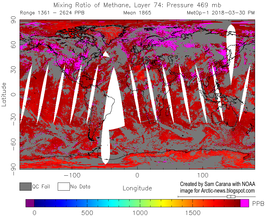

    On April 1, 2018, methane levels as high as 2744 parts per billion were recorded.


    The situation is dire and calls for comprehensive and effective action, as described in the Climate Plan.


    Links

    • Climate Plan
    https://arctic-news.blogspot.com/p/climateplan.html

    • Extinction
    https://arctic-news.blogspot.com/p/extinction.html

    • How much warming have humans caused?
    https://arctic-news.blogspot.com/2016/05/how-much-warming-have-humans-caused.html

    • IPCC seeks to downplay global warming
    https://arctic-news.blogspot.com/2018/02/ipcc-seeks-to-downplay-global-warming.html

    • 2016 well above 1.5°C
    https://arctic-news.blogspot.com/2017/01/2016-well-above-1.5c.html

    • Interpretations of the Paris climate target, by Andrew Schurer et al.
    https://www.nature.com/articles/s41561-018-0086-8


    Tuesday, February 20, 2018

    IPCC seeks to downplay global warming

    The graph below shows global warming for a 30-year period centered on January 2018, using NASA 2003 to January 2018 LOTI anomalies from 1951-1980, adjusted by 0.59°C to cater for the rise from preindustrial to 1951-1980, and with a polynomial trend added.


    From: ECMWF Nino Plumes
    Above graph shows that the 1.5°C guardrail, set at the Paris Agreement, was crossed in 2016 and that a 10°C (18°F) warming could eventuate within a decade or so.

    The variations in above temperature data are strongly influenced by El Niño/La Niña. We currently are in a La Niña period, during which surface temperatures are suppressed, whereas surface temperatures in 2016 were much above the trendline, due to El Niño.

    The ECMWF forecast from 1 February 2018 on the right indicates that we're heading for another El Niño, i.e. surface temperatures will be rising strongly over the coming months.

    The IPCC seeks to downplay the amount of global warming that has already occurred and that looks set to eventuate over the next decade or so. A leaked draft of the IPCC 'Special Report on 1.5°C above pre-industrial' (First Order Draft of SR1.5 SPM) estimates that the global mean temperature reached approximately 1°C above pre-industrial levels around 2017/2018. The IPCC appears to have arrived at this estimate using an extrapolation or near term predictions of future warming so that the level of anthropogenic warming is reported for a 30 year period centered on today.

    This 1°C IPCC estimate looks quite incredible when calculating the temperature rise using NASA's data for the two most recent years for which data are available (2016/2017), which shows a warming of 0.95°C when using a baseline of 1951-1980 and a warming of 1.23°C when using a baseline of 1890-1910.


    Indeed, the temperature rise differs depending on which baseline is used, and when using preindustrial as a baseline, i.e. the baseline agreed to at the Paris Agreement, indications are that temperatures have already risen by more than 1.5°C, as also discussed in an earlier post.

    Furthermore, when using a 30-year period centered on January 2018, the current temperature will have to be calculated over the past 15 years and estimated for the next 15 years, i.e. up to the year 2033.

    To arrive at a 1°C rise for the 30-year period, the IPCC must somehow assume that temperatures will magically fall dramatically over the next 15 years, whereas indications are that temperatures will instead rise dramatically over the next decade or so.

    The image on the right shows that 10°C (18°F) warming from preindustrial could eventuate within one decade when taking into full account the warming that could result from the elements depicted in the stacked bar. Each of these warming elements is discussed in more detail at the extinction page.

    The image below shows the rise from 1750 to 2030, in surface temperatures (land+ocean), rather than in anomalies.


    The situation is dire and calls for comprehensive and effective action, as described in the Climate Plan.


    Thursday, April 23, 2015

    It's time to 'Do the math' again

    By David Spratt

    Have we gone mad? A new report released today explains why contemporary climate change policy-making should be characterised as increasingly delusional.

    As the deadline approaches for submissions to the Australian government's climate targets process, there is a flurry of submissions and reports from advocacy groups and the Climate Change Authority.

    Most of these reports are based on the twin propositions that two degrees Celsius (2°C) of global warming is an appropriate policy target, and that there is a significant carbon budget and an amount of "burnable carbon" for this target, and hence a scientifically-based escalating ladder of emission-reduction targets stretching to mid-century and beyond.

    A survey of the relevant scientific literature by David Spratt, "Recount: It's time to 'Do the math' again", published today by Breakthrough concludes that the evidence does not support either of these propositions.

    The catastrophic and irreversible consequences of 2°C of warming demand a strong risk-management approach, with a low rate of failure. We should not take risks with the climate that we would not take with civil infrastructure.

    There is no carbon budget available if 2°C is considered a cap or upper boundary as per the Copenhagen Accord, rather than a hit-or-miss target which can be significantly exceeded; or if a low risk of exceeding 2°C is required; or if positive feedbacks such as permafrost and other carbon store losses are taken into account.

    Effective policy making can only be based on recognising that climate change is already dangerous, and we have no carbon budget left to divide up. Big tipping-point events irreversible on human time scales such as in West Antarctica and large-scale positive feedbacks are already occurring at less than 1°C of warming. It is clear that 2°C of climate warming is not a safe cap.

    In reality, 2°C is the boundary between dangerous and very dangerous climate change and 1°C warmer than human civilisation has ever experienced.

    In the lead up to the forthcoming Paris talks, policy makers through their willful neglect of the evidence are in effect normalising a 2.5–3°C global warming target.

    This evidence in "Recount: It's time to 'Do the math' again" demonstrates that action is necessary at a faster pace than most policy makers conceive is possible.


    Related

    - It's time to 'Do the math' again
    http://www.climatecodered.org/2015/04/its-time-to-do-math-again.html

    - RECOUNT - It's time to 'Do the math' again
    http://media.wix.com/ugd/148cb0_938b5512abfa4d4e965ec8cc292893f7.pdf

    - Two degrees of warming closer than you may think
    http://arctic-news.blogspot.com/2015/02/two-degrees-of-warming-closer-than-you-may-think.html

    - The real budgetary emergency and the myth of "burnable carbon"
    http://arctic-news.blogspot.com/2014/05/the-real-budgetary-emergency-and-the-myth-of-burnable-carbon.html

    It's time to 'Do the math' again | by David Spratt http://arctic-news.blogspot.com/2015/04/its-time-to-do-math-again.html

    Posted by Sam Carana on Thursday, April 23, 2015

    Sora

    • Street :Lane Road 00
    • Person :Person
    • Phone :+012 345 678 910
    • Country :ENGLAND
    • Email :soratemplate@gmail.com

    Get in Touch

    Feel free to drop us a line to contact us

    Contact Form

    Name

    Email *

    Message *


    Feel free To Contact

    Lorem ipsum dolor sit amet, consectetur adipisicing elit. Voluptate dolores, quasi unde quisquam facilis at ullam aperiam similique dicta voluptatibus!

    • 3066 Stone Lane, Wayne, Pennsylvania.
    • +610-401-6021, +610-401-6022
    • soratemplate@gmail.com
    • www.soratemplates.com

    Pages