20.000+ Bungalows 1.000+ Appartments

Search : Homes, Penthouse, Farmhouse etc.

Property Features

Here you can explain about property features.
  • Low Budget

    Lorem Ipsum is simply dummy text of the printing and typesetting industry.

  • Penthouse

    Lorem Ipsum is simply dummy text of the printing and typesetting industry.

  • Natural Light

    Lorem Ipsum is simply dummy text of the printing and typesetting industry.

  • Public Transport

    Lorem Ipsum is simply dummy text of the printing and typesetting industry.

  • Eco Friendly

    Lorem Ipsum is simply dummy text of the printing and typesetting industry.

  • Fire Proof

    Lorem Ipsum is simply dummy text of the printing and typesetting industry.

  • Nearby Store

    Lorem Ipsum is simply dummy text of the printing and typesetting industry.

  • Secured

    Lorem Ipsum is simply dummy text of the printing and typesetting industry.

    We have Delivered

    1500

    Houses Build

    4150

    Rented House

    860

    Shops Build

    52

    On Progress

    Our Portfolio.

    A creative agency that believes in the power of creative ideas and great design.
    Showing posts with label rise. Show all posts
    Showing posts with label rise. Show all posts

    Monday, April 2, 2018

    How much warmer is it now?

    The IPCC appears to be strongly downplaying the amount of global warming that has already occurred and that looks set to eventuate over the next decade or so, according to a leaked draft of the IPCC 'Special Report on 1.5°C above pre-industrial'. The 'First Order Draft of the Summary for Policy Makers' estimates that the global mean temperature reached approximately 1°C above pre-industrial levels around 2017/2018.

    Let's go over the numbers step by step, by following the image below line by line (click on the image to enlarge it).

    NASA's data for the two most recent years for which data are available (2016/2017) show a warming of 0.95°C when using a baseline of 1951-1980 and a warming of 1.23°C when using a baseline of 1890-1910 (left map on image below). In other words, using this earlier baseline results in an additional 0.28°C rise. When using an even earlier baseline, i.e. 1750 or preindustrial, it could be 1.53°C warmer, as discussed in an earlier post.


    In other words, merely changing the baseline to preindustrial, as agreed to at the Paris Agreement, can show that we're already above the 1.5°C guardrail that the Paris Agreement had pledged we should not cross.

    There's more! As a recent publication points out, most methods that calculate the global temperature use sea surface temperatures. However, doesn't it make more sense to calculate the temperature of the air just above the sea surface? Measuring air temperature at the surface is done in the case of temperatures over land, where one doesn't measure the temperature of the soil or rocks when telling people how warm it is. Since air surface temperatures are slightly higher than sea surface temperatures, the result of looking at air surface temperatures across the globe would be a temperature that is approximately 0.1°C warmer. Furthermore, many areas in the Arctic may not have been adequately reflected in the global temperature, e.g. because insufficient data were available. Since the Arctic has been warming much faster than the rest of the world, inclusion of those areas would add another 0.1°C to the rise. Adding this to the above 1.53°C rise makes that it's already 1.73°C (or 3.11°F) warmer than preindustrial.

    Another question is over what period measurements should be taken when assessing whether thresholds have been crossed. When focusing on temperatures during specific months, the rise could be much higher than the annual average. So, does it make more sense to look at a monthly peak rather than at a long-term average?

    When building a bridge and when calculating what load the bridge should be able to handle, it makes sense to look at peak traffic and at times when a lot of heavy trucks happen to be on the bridge. That makes a lot more sense than only looking at the average weight of cars driving over the bridge during a period of - say - one, two or thirty years.


    Accordingly, the right panel of the top image shows numbers for February 2016 when temperature anomalies were particularly high. When looking at this monthly anomaly, we are already 2.37°C (or 4.27°F) above preindustrial, i.e. well above the 2°C guardrail that the Paris Agreement had pledged we should definitely not cross.

    Should the temperature rise be calculated using a longer period? The IPCC appears to have arrived at its temperature rise estimate by using an extrapolation or near term predictions of future warming so that the level of anthropogenic warming is reported for a 30 year period centered on today.

    The image below, from an earlier post, shows global warming for a 30-year period centered on January 2018, using NASA 2003 to January 2018 LOTI anomalies from 1951-1980, adjusted by 0.59°C to cater for the rise from preindustrial to 1951-1980, and with a polynomial trend added.


    If above trendline is adjusted by a further 0.2°C, by shifting to air temperatures instead of sea surface temperatures, and by better reflecting Arctic temperatures, then the trendline looks set to cross the 2°C guardrail in 2018. So, will Earth cross 2°C in 2018?


    Above images illustrate the importance of what's going to happen next. The temperature rise up until now may well be dwarfed by what's yet to come and the outlook may well be even worse than what most fear will eventuate. The image below, from an earlier post, shows a steep rise from 2016 to 2026, due to the combined impact of the warming elements listed in the left box of the image below.


    Meanwhile, the rise in carbon dioxide levels appears to be accelerating, as illustrated by the images below.


    Indeed, despite pledges made at the Paris Agreement to limit the temperature increase to 1.5°C above pre-industrial, the rise in CO₂ since preindustrial, i.e. 1750, still appears to be accelerating.


    On March 18, 2018, the sea surface temperature near Svalbard (at the green circle) was 16.7°C or 62.1°F, i.e. 14.7°C or 26.4°F warmer than the daily average during the years 1981-2011.


    On March 30, 2018, methane levels as high as 2624 parts per billion were recorded.
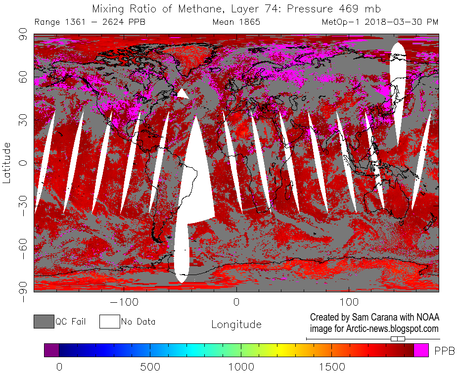

    On April 1, 2018, methane levels as high as 2744 parts per billion were recorded.


    The situation is dire and calls for comprehensive and effective action, as described in the Climate Plan.


    Links

    • Climate Plan
    https://arctic-news.blogspot.com/p/climateplan.html

    • Extinction
    https://arctic-news.blogspot.com/p/extinction.html

    • How much warming have humans caused?
    https://arctic-news.blogspot.com/2016/05/how-much-warming-have-humans-caused.html

    • IPCC seeks to downplay global warming
    https://arctic-news.blogspot.com/2018/02/ipcc-seeks-to-downplay-global-warming.html

    • 2016 well above 1.5°C
    https://arctic-news.blogspot.com/2017/01/2016-well-above-1.5c.html

    • Interpretations of the Paris climate target, by Andrew Schurer et al.
    https://www.nature.com/articles/s41561-018-0086-8


    Saturday, March 3, 2018

    Warning Signs


    The Arctic is warming up more than twice as fast as the rest of the world, due to numerous feedbacks. At times, large areas over the Arctic Ocean can become 30°C or 54°F warmer than 1979-2000, as illustrated by the image below.


    On February 27, 2018, large parts of the Arctic Ocean north of Greenland had turned into open water, as illustrated by the image below.


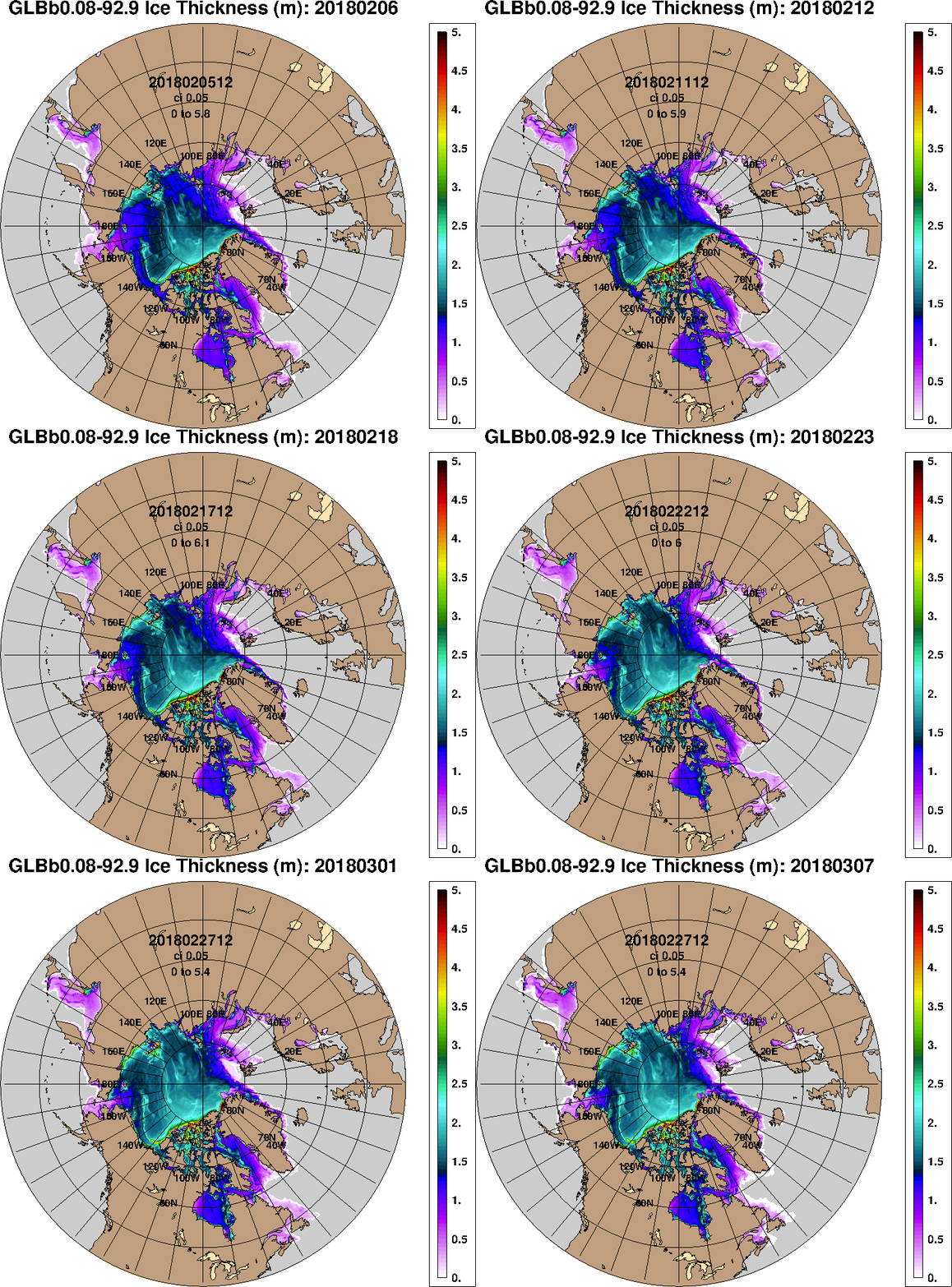
    Yet, while the situation in the Arctic is desperate, with sea ice north of Greenland collapsing and more, mainstream media do not seem to care. If there ever were warning signs of what could eventuate, this is one. The sea ice north of Greenland is typically the thickest, as it is the least affected by melting and can build over many years. Early February 2018, sea ice north of Greenland was up to 5 m thick. To see sea ice this thick getting pushed away and open water emerging north of Greenland in the middle of winter is simply stunning.

    For years, I've been warning about the situation in the Arctic, in particular the 'Open Doors Feedback', which is accelerating Arctic warming. Such feedbacks were taken into consideration in an earlier analysis that warned about a potential 1.6°C warming globally due to albedo changes in the Arctic, in combination with associated changes such as loss of the ice buffer (latent heat), more heat transfer from the Atlantic Ocean to the Arctic Ocean due to stronger winds along the path of the Gulf Stream, and more heat entering the atmosphere or remaining in the atmosphere, due to more open water in the Arctic Ocean and as oceans get more stratified and take up less heat from the atmosphere.

    So, the current situation doesn't come as a big surprise, but it's stunning to see sea ice collapse north of Greenland.

    Back in March 7, 2007, I posted the article 'Ten Dangers of Global Warming', describing events getting progressively worse, with one danger feeding and reinforcing the next one, culminating in panic. Then, I thought that reading that post could at least help people better understand what's going on, and thus help people avoid panicking, but right now, I wonder whether most people do want to understand at all. Anyway, here are some images and words describing what happened over the past few days.

    Jet Stream over Arctic Ocean on February 25, 2018

    As Arctic warming keeps accelerating, there's ever less temperature difference between the North Pole and the Equator, and this slows down the speed at which the jet stream circumnavigates Earth.

    Jet Stream over Arctic Ocean on February 26, 2018
    The jet stream is getting more wavy and a more wavy jet stream makes it easier for cold air to move out of the Arctic and for warm air to move into the Arctic, so this 'Open Doors Feedback' is a self-reinforcing feedback that further accelerates warming in the Arctic.

    During the northern winter, the Arctic is increasingly getting warmer than North America, Europe and Siberia. This increases the temperature difference between these continents and the oceans, which at times is causing winds to strongly speed up over the North Atlantic and the North Pacific, making an already wavy jet stream extend even further over the Arctic Ocean, reaching areas well beyond the North Pole.

    Atmospheric river of heat reaches the North Pole; temperatures were as high as 1.1°C or 34.1°F on February 25, 2018
    As the jet stream makes this detour, a huge amount of heat enters the Arctic from the south.

    Temperatures above 6°C at Kap Morris Jesup, Greenland's northernmost weather station, on February 25, 2018

    These events were preceded by the Polar Vortex splitting up. On February 9, 2018, the Polar Vortex was split up into 4 vortices and reached speeds as fast as 425 km/h or 264 mph.

    Polar Vortex split up into 4 vortices
    A Sudden Stratospheric Warming event occurred on February 16, 2018, with temperatures reaching as high as 8.9°C or 47.9°F over Hudson Bay.

    Polar Vortex splitting up into 4 vortices with a Sudden Stratospheric Warming event occurring on February 16, 2018
    The heat that has accumulated in the Arctic Ocean is further illustrated by the February 2018 NASA temperature anomalies image below.


    Below is an animation of sea ice thickness, from the Naval Research Laboratory.


    Arctic sea ice extent was at record low for the time of the year on February 26, 2018, at 14.159 million km². Arctic sea ice extent typically reaches its maximum in March, but maximum extent in 1991-2000 was reached on February 24. So, there is a chance that Arctic sea ice extent will go all downhill from now on this year.


    Zero sea ice volume is within the margins of the trend depicted on the image above on the right. Decline of the snow and ice cover in the Arctic comes with a huge loss in albedo, which means that huge amounts of sunlight that were previously reflected back into space instead get absorbed by the Arctic. Loss of sea ice also means loss of the buffer that until now has consumed huge amounts of heat.

    The Buffer has gone, feedback #14 on the Feedbacks page
    Peak SST near Svalbard rose from
    12.4°C or 55.4°F on Feb 23, 2018,
    to 15.6°C or 60°F on Mar 2, 2018.
    The danger is that a sudden influx of heat can no longer be absorbed by the sea ice and will instead warm up sediments at the seafloor of the Arctic Ocean that can contain huge quantities of methane in the form of hydrates and free gas.

    Destabilization of hydrates can occur in a relatively small area as a result of a relatively small temperature rise. Destabilization comes with a 160 times expansion in volume of the methane, which will send out shock waves that can destabilize nearby hydrates, causing them to destabilize as well, resulting in an eruption of huge quantities of methane over a large area.

    Here's another warning sign. Peak sea surface temperature near Svalbard rose from 12.4°C or 55.4°F on February 23, 2018, to 15.6°C or 60°F on March 2, 2018, as illustrated by the red line on the image on the right, with the blue line showing the 1981-2011 average.

    And here's another warning sign. High methane releases followed this chain of events on February 27, 2018, pm, likely originating from the seafloor of the East Siberian Arctic Shelf (ESAS).

    Methane levels as high as 2892 ppb on February 27, 2018
    On March 1, 2018, methane levels as high as 3087 were recorded. Note the solid magenta-colored areas over the ESAS on the image below.


    The image below, with measurement by another satellite, shows that methane levels were again very high over the ESAS the next day, i.e. March 2, 2018, confirming earlier indications that this is where the very high methane releases did occur.

    As the image below shows, methane levels on March 4, 2018, were still very high, i.e. as high as 2964 ppb.

    The image below shows the highest mean global methane readings on March 10 over the years from 2013 through 2018, for selected altitudes corresponding to 945 mb (close to sea level) to 74 mb.

    [ click on images to enlarge ]
    The table below shows the altitude equivalents in feet (ft), meter (m) and millibar (mb).
    57,016 ft44,690 ft36,850 ft30,570 ft25,544 ft19,820 ft14,385 ft 8,368 ft1,916 ft
    17,378 m13,621 m11,232 m 9,318 m 7,786 m 6,041 m 4,384 m 2,551 m 584 m
     74 mb 147 mb 218 mb 293 mb 367 mb 469 mb 586 mb 742 mb 945 mb

    An earlier analysis calculated that seafloor methane could cause a warming of 1.1°C within one decade. Given a possible additional warming of 2.7°C due to just two elements (i.e. Arctic albedo changes and associated changes, and seafloor methane), a further warming of 2.1°C due to extra water vapor in the warmer atmosphere does seem well possible within a decade. Add up the impact of all warming elements of this analysis and the rise in mean global temperatures from preindustrial could be more than 10°C within one decade, as illustrated by the images below.


    A rise of a few degrees Celsius would be devastating, especially when considering that the speed at which such a rise could occur leaves little or no time for plants and animals to adapt, let alone in case of a 10°C rise.


    The situation is dire and calls for comprehensive and effective action, as described in the Climate Plan.

    Links

    • Climate Plan
    https://arctic-news.blogspot.com/p/climateplan.html

    • Feedbacks in the Arctic
    https://arctic-news.blogspot.com/p/feedbacks.html

    • Extinction
    https://arctic-news.blogspot.com/p/extinction.html

    • Ten Dangers of Global Warming
    https://arctic-news.blogspot.com/p/ten-dangers-of-global-warming.html

    • Methane Erupting From Arctic Ocean Seafloor
    https://arctic-news.blogspot.com/2017/03/methane-erupting-from-arctic-ocean-seafloor.html

    • Warning of mass extinction of species, including humans, within one decade
    https://arctic-news.blogspot.com/2017/02/warning-of-mass-extinction-of-species-including-humans-within-one-decade.html


    Tuesday, February 20, 2018

    IPCC seeks to downplay global warming

    The graph below shows global warming for a 30-year period centered on January 2018, using NASA 2003 to January 2018 LOTI anomalies from 1951-1980, adjusted by 0.59°C to cater for the rise from preindustrial to 1951-1980, and with a polynomial trend added.


    From: ECMWF Nino Plumes
    Above graph shows that the 1.5°C guardrail, set at the Paris Agreement, was crossed in 2016 and that a 10°C (18°F) warming could eventuate within a decade or so.

    The variations in above temperature data are strongly influenced by El Niño/La Niña. We currently are in a La Niña period, during which surface temperatures are suppressed, whereas surface temperatures in 2016 were much above the trendline, due to El Niño.

    The ECMWF forecast from 1 February 2018 on the right indicates that we're heading for another El Niño, i.e. surface temperatures will be rising strongly over the coming months.

    The IPCC seeks to downplay the amount of global warming that has already occurred and that looks set to eventuate over the next decade or so. A leaked draft of the IPCC 'Special Report on 1.5°C above pre-industrial' (First Order Draft of SR1.5 SPM) estimates that the global mean temperature reached approximately 1°C above pre-industrial levels around 2017/2018. The IPCC appears to have arrived at this estimate using an extrapolation or near term predictions of future warming so that the level of anthropogenic warming is reported for a 30 year period centered on today.

    This 1°C IPCC estimate looks quite incredible when calculating the temperature rise using NASA's data for the two most recent years for which data are available (2016/2017), which shows a warming of 0.95°C when using a baseline of 1951-1980 and a warming of 1.23°C when using a baseline of 1890-1910.


    Indeed, the temperature rise differs depending on which baseline is used, and when using preindustrial as a baseline, i.e. the baseline agreed to at the Paris Agreement, indications are that temperatures have already risen by more than 1.5°C, as also discussed in an earlier post.

    Furthermore, when using a 30-year period centered on January 2018, the current temperature will have to be calculated over the past 15 years and estimated for the next 15 years, i.e. up to the year 2033.

    To arrive at a 1°C rise for the 30-year period, the IPCC must somehow assume that temperatures will magically fall dramatically over the next 15 years, whereas indications are that temperatures will instead rise dramatically over the next decade or so.

    The image on the right shows that 10°C (18°F) warming from preindustrial could eventuate within one decade when taking into full account the warming that could result from the elements depicted in the stacked bar. Each of these warming elements is discussed in more detail at the extinction page.

    The image below shows the rise from 1750 to 2030, in surface temperatures (land+ocean), rather than in anomalies.


    The situation is dire and calls for comprehensive and effective action, as described in the Climate Plan.


    Thursday, February 1, 2018

    North Pole forecast to be above freezing on Feb 5, 2018

    The image below shows a forecast of above freezing temperatures over the North Pole on Feb 5, 2018.


    Above image shows a forecast of air temperature of 0.2°C or 32.4°F at 1000 hPa over the North Pole on February 5, 2018, 21:00 UTC.


    Above image shows a forecast of temperatures of 1.1 °C or 33.9°F at the North Pole at 1000 hPa, on February 5, 2018, 18:00 UTC.


    Above image shows a large area around the North Pole forecast to be up to 30°C or 54°F warmer than 1979-2000 on February 5, 2018.


    Above image shows sea surface temperatures as high as 15.1°C or 59.2°F near Svalbard on February 9, 2018, in the panel on the left, and air temperatures as high as 6°C or 42.7°F (at 1000 hPa) near Svalbard on February 10, 2018, in the panel on the right.


    These high temperatures are caused not only by ocean heat, but also by strong winds pushing warm air and water up from the North Atlantic into the Arctic. Above image shows the Jet Stream moving at speeds as high as 315 km/h or 196 mph (green circle, February 6, 2018, 6:00 UTC), moving in backward direction over Scandinavia, while extending over Antarctica and crossing the Equator at a number of places.


    The decreasing temperature difference between the North Pole and the Equator is slowing down the speed at which the jet stream circumnavigates Earth and this is also making the jet stream more wavy.

    As a more wavy jet stream extends deeper down over land, it allows cold air from the Arctic to flow down over land. As temperatures over land fall, the difference between ocean temperature and land temperature increases, especially in winter when land temperatures are much lower than ocean temperatures. This increasing difference between land and ocean temperature makes winds stronger and faster over oceans.

    [ click on images to enlarge ]
    In above image, the left panel shows a wavy jet stream speeding up over the North Atlantic, reaching speeds as high as 345 km/h or 215 mph (at green circle, 250 hPa).

    In above image, the right panel shows strong winds pushing warm air from the Pacific Ocean through Bering Strait, resulting in temperatures over Alaska as high as 6.6°C or 44°F (at green circle, at 850 hPa).

    The image on the right shows that waves as high as 8.27 m or 27.2 ft (at green circle) are forecast to enter the Arctic Ocean near Svalbard on February 5, 2018, giving an indication of the huge amount of energy that is going into oceans.

    Earth is retaining more heat. This translates into higher surface temperatures, more heat getting stored in oceans and stronger winds. This in turn is causing higher waves and more evaporation from the sea surface. The image on the right shows a forecast of total amount of cloud water (in air from surface to space) of 1.5 kg/m² (green circle) in between Svalbard and the North Pole on February 5, 2018.

    Warm air, warm water and high waves make it hard for sea ice to form, while evaporation from the ocean adds more water vapor to the atmosphere. Since water vapor is a potent greenhouse gas, this further accelerates warming of the Arctic.

    The high temperatures at the North Pole follow high temperatures over East Siberia, as illustrated by the image below.


    Above image shows average temperature anomalies for January 31, 2018, compared to 1979-2000. The image below shows open water on the East Siberian coast in the Arctic Ocean that day.


    Meanwhile, Arctic sea ice extent is very low. The image below shows that extent on January 30, 2018, was 13.391 million km², a record low for the time of the year.


    In the video below, Paul Beckwith discusses the situation.


    In the podcast below, by Wolfgang Werminghausenentitled Sam Carana about the Arctic and global temperature, Sam Carana's responses are read by Kevin Hester.

    From the interview, Sam Carana: "Methane releases from the seafloor of the Arctic Ocean have a strong warming impact, especially locally, AND methane releases in the Arctic also act as a catalyst for other feedbacks that are all self-reinforcing and interlinked, amplifying each other in many ways. It could easily become 10°C or 18°F warmer in a matter of years, especially in places where most people are now living."


    The image below shows that on February 11, 2018, methane reached peak levels as high as 2925 ppb.

    High methane peaks are becoming more common as the water temperature of oceans keeps rising, which also goes hand in hand with more water vapor and less sea ice. As said, these are all warming elements that amplify each other in many ways.

    On Feb 8, 2018, Antarctic sea ice extent was 2.382 million km², a record low for the time of the year and 1.811 million km² less than the extent on Feb 8, 2014.

    The image on the right illustrates the huge loss of sea ice around Antarctica over the past few years. Antarctic sea ice looks set to reach an all-time low extent later this month, with a difference of close to 2 million km² persisting, compared to just a few years ago.

    The image below shows a forecast for February 5, 2018, with as much as 3.84 kg/m² (green circle) Total Cloud Water in between South Africa and Antarctica.


    More water vapor in the air contributes to global warming, since water vapor is a potent greenhouse gas. The image below shows a forecast for February 5, 2018, with temperatures on Antarctica reaching as high as 8.9°C or 47.9°F (update Feb. 11, 2018: 7.1°C or 44.7°F at 78°S, 17°E at 1000 hPa on Feb. 5, 2018, 15:00z).


    At this time of year, global sea ice is typically at its lowest extent for the year. On February 9, 2018, global sea ice reached the lowest extent on record, as illustrated by the image below by Wipneus.


    This means that a huge amount of sunlight that was previously reflected back into space is now instead getting absorbed by oceans.

    The situation is dire and calls for comprehensive and effective action, as described in the Climate Plan.


    Sora

    • Street :Lane Road 00
    • Person :Person
    • Phone :+012 345 678 910
    • Country :ENGLAND
    • Email :soratemplate@gmail.com

    Get in Touch

    Feel free to drop us a line to contact us

    Contact Form

    Name

    Email *

    Message *


    Feel free To Contact

    Lorem ipsum dolor sit amet, consectetur adipisicing elit. Voluptate dolores, quasi unde quisquam facilis at ullam aperiam similique dicta voluptatibus!

    • 3066 Stone Lane, Wayne, Pennsylvania.
    • +610-401-6021, +610-401-6022
    • soratemplate@gmail.com
    • www.soratemplates.com

    Pages